Thursday, 27 October 2011
Creative use of technology
In our video, the main use of technology we will use is the editing programs for our video and our images for the digipak and advert. We used the lens cover switch on the camera during our video to create the opening scenes through the forest, as this records the opening of the lens and then the mass of light an slow focusing which fit really well with the opening of our song. we also made use of the colour corrector tool in final cut to stop one clip looking too green and we also made use of the motion keyframes, to animate various video movements and text movements. We also altered the opacity of various clips to make things fade in and out to make the transitions easier than very blunt and short. In our digipak we used various transformations to warp the text to get it to fit on the tree, we also used various techniques to colour the band's name and various techniques to make the writing readable. On the magazine advert we made use of the leaf brush in photoshop and then turn into black and white to create an interesting background and to make it more interesting than one plain colour.
Friday, 21 October 2011
Location Report


This is the location report for our music video. The forest will be a main feature of our music video and ancillary products, as it reflects the name of our artist, 'Autumn'. We chose to use the forest area at the college because as you can see, it is a very picturesque location and would look very good in our music video and on our ancillary products. There are a variety of areas within the forest that we could use for our music video, with each bit adding something different to the shot or to the scene. We also will be using one of the dance studios for part of the music video. This will be for the dance routine section so that we can take advantage of the different lighting techniques we will be able to use and make it seem as though it is a real stage performance.
In reflection, you can see that we didn't use the dance studio for our music video. This is because we had trouble getting it when it was free and having all the performers ready at that same time. We did shoot the dance routine, but we used a different location and got an sequence that we liked. We did use the forest for our music video but because our video was shot later on in the year, there are less leaves and makes the whole scene look bleaker. Having said that, the added colours of the Autumn leaves had a good effect on our products and allowed us to incorporate them into our ancillary products as more of a feature. Having the video in Autumn with all the leaves fallen off also adds to the texture of the video as it reflects the emotions portrayed in the lyrics.
Goodwin's analysis of My Heart Takes Over
The music video sticks to genre conventions quite closely, but doesn't have a main dance routine this is mainly due to the subdues nature of the song and it being quite slow and solemn, but it is still upbeat enough to facilitate many cuts. There is an amplifying relationship between the lyrics and visuals as the speed of the cuts relates to the speed of the song which prevents the video looking strange this is also helped by the the music and visuals also being an amplifying relationship which makes the music video even more effective. There is also a lot of solo shots of each group member which are mostly close-ups which will meet the demands of the record label, this is very varied to the chorus where there is a lot of full body group shots, which are also filmed from a low angle which gives the girls an air of elegance and power. The video also follows various motifs that have been created through over videos of solo members, then during the chorus, the whole group assembles, also quite a lot of the solo members sections is when they are filmed to the side/ off center of the frame.


Thursday, 13 October 2011
Magazine Advert Analysis
These are examples of magazine adverts. The first one is from another media group at the college whilst the other two are from actual music groups.

 |
 |
This first advert is from another media group at the college. Compared to the other two featured, there is a lot less information on the advert, with just the artist, the song name and some retailers on the page. This is a good basis for our magazine advert because it shows the minimum of what we can include.
On this magazine ad, there is a simple shot taken from their music video with the information below it. I think that the group that made this used too many fonts on their magazine ad, making it harder to read. For our magazine, I think we should only use one or two different fonts so that the audience can recognize the theme throughout the advert. I think that the image used in the advert is very effective because of how it has been edited. Because the image has been blurred, you know that it is from the music video but it also has a more commercial feel that can be a significant aspect of all their magazine ads in the future.
The second advert is for the Gorillaz tour. Because of this, some conventions of album magazine ads won't be present but some aspect will still be comparrable. A lot more information is on this advert that the Bruno Mars, as well as a seperate advert for a competition giving away tickets for the event. There is a large amount of colour contrast, using dark colours for the images of the group and a light background when displaying the information for the tour. This makes it easy to read and to understand the information. Because the group is in a dark light, it gives a mysterious feel which could represent a surprise at one of the group's event. The layout of this advert is good and could be something that we can base our magazine advert around. The band logo is bright enough to stand out agains the image making it instantly recognisable to any fans that they have. For our magazine ad, I think that having the information below the image rather than on it would be beneficial because it stands out more, doesnt restrict the amount of information that can be included so the image isnt blocked and doesnt take the interest away from the background information.

The final advert is for the foo fighters. This magazine advert has a similar layout to the other two with the image on top with the main information below, making it easier to read. This advert is pretty basic, leaving out pieces of information such as the price of the albums and where it is available to buy. It does however, have a release date and the different formats that it can be gotten from. Also on the advert is an insight into some of the songs on the album. This would benefit potential buyers because they would be more likely to buy it if they know what songs are on the album than if they had to wait until they bought it to find out. Because of the logo of the band, all the information is easy to read and stands out. This doesnt apply to all groups so when we are making our magazine advert, we will have to be careful as to not block out any of the logo or the image that we might include on the advert.
Tuesday, 11 October 2011
Goodwins Analysis of Secret Crowds
Font Research
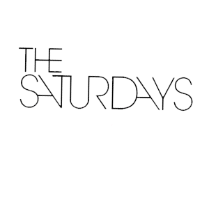
This is the logo for The Saturdays. As you can see the text is slender and straight, so we will base our logo on this as well. We have decided to call our band name "Autumn" because it is a season rather than a day of the week. This shows the relation between the two groups, but also signifies the difference between the two.

 On the right is a basic font that could be used in our groups logo. Because the band name is a season, rather than a day in the week, there are more aspects that can be related to it. Things like brown leaves, scarves and other things like that. We would be able to use this to add more layers to the simple font to add more texture to it and to make it stand out more. Because of the possibilities of what we can add to the font, we could have something like a core logo then add to it and adapt it for each of the things we do. This would allow us to change the dynamics of the logo according to it's context. An example of this could be having pages around the font to represent that it is a magazine advert. The core logo would likely be to do with Autumn, to emphasize the significance of the song name. We would have to be careful when designing the logo so that we don't leave too much empty spaces so that it looks unprofessional as well as leaving enough space so that the new layers to it will be enough to make an impact and so that customers can see the difference and recognize that it is to do with something else.
 On the right is a basic font that could be used in our groups logo. Because the band name is a season, rather than a day in the week, there are more aspects that can be related to it. Things like brown leaves, scarves and other things like that. We would be able to use this to add more layers to the simple font to add more texture to it and to make it stand out more. Because of the possibilities of what we can add to the font, we could have something like a core logo then add to it and adapt it for each of the things we do. This would allow us to change the dynamics of the logo according to it's context. An example of this could be having pages around the font to represent that it is a magazine advert. The core logo would likely be to do with Autumn, to emphasize the significance of the song name. We would have to be careful when designing the logo so that we don't leave too much empty spaces so that it looks unprofessional as well as leaving enough space so that the new layers to it will be enough to make an impact and so that customers can see the difference and recognize that it is to do with something else.
Storyboard Timeline
This is our storyboard timeline. To make it easier to understand, we used a key, using three numbers to represent what will be happening in each box or 5 second gap.
The 1s represent the scenes within the car
The 2s represent the times when the music video is shot in the park and
The 3s are when the dance sequence is happening on the stage.


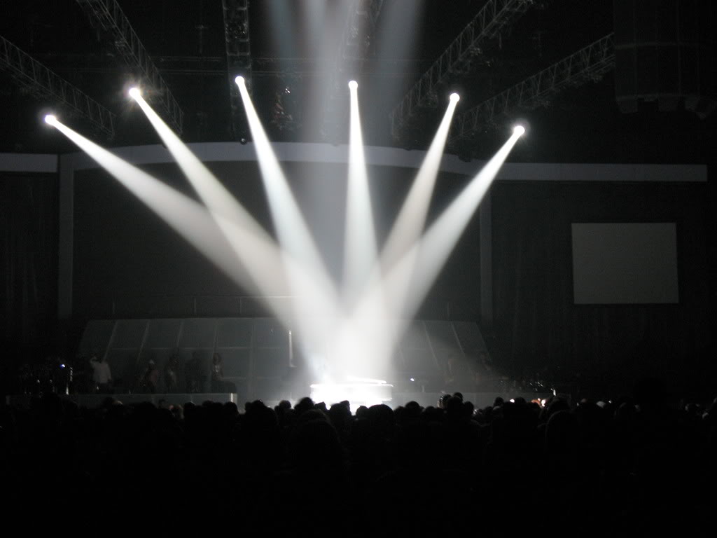
Ideas for our concert/ dance scene
Due to our previous test footage, we found out which colours of lights to use, which are blues, purples and reds to create the appropriate feel for our video during this scene, we also found out that the drama studio has a projector allowing us to project either a backdrop or to film half of our group and project them into the background meaning we are only dealing with one half of our group at once instead of all four.
Concert Backdrops:

Concert Backdrops:
Thursday, 6 October 2011
Pitch feedback
The feedback from our pitch was to use the same girls the whole time instead of two different sets of girls. We were also suggested to think of another area to use incase the drama studio wasn't able to be used when we needed it.
Tuesday, 4 October 2011
Test Footage - Drama Studio - Lighting
The Test shots gave us an idea of how the lights will work with lighting our artists and gave us an idea of what colours and positions to use. We also found out that we could use a projected background instead of just curtains which also gave us the idea of splitting our dancers in half and filming half of them at a time them projecting the other half on the screen behind the current half, this would allow us greater versatility as we wouldn't need to organise 4 people, only 2 but would require better synchronisation for the real half.
Subscribe to:
Posts (Atom)