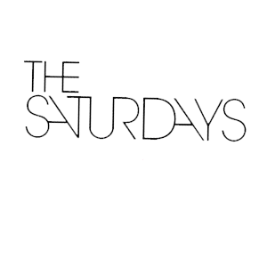
This is the logo for The Saturdays. As you can see the text is slender and straight, so we will base our logo on this as well. We have decided to call our band name "Autumn" because it is a season rather than a day of the week. This shows the relation between the two groups, but also signifies the difference between the two.

 On the right is a basic font that could be used in our groups logo. Because the band name is a season, rather than a day in the week, there are more aspects that can be related to it. Things like brown leaves, scarves and other things like that. We would be able to use this to add more layers to the simple font to add more texture to it and to make it stand out more. Because of the possibilities of what we can add to the font, we could have something like a core logo then add to it and adapt it for each of the things we do. This would allow us to change the dynamics of the logo according to it's context. An example of this could be having pages around the font to represent that it is a magazine advert. The core logo would likely be to do with Autumn, to emphasize the significance of the song name. We would have to be careful when designing the logo so that we don't leave too much empty spaces so that it looks unprofessional as well as leaving enough space so that the new layers to it will be enough to make an impact and so that customers can see the difference and recognize that it is to do with something else.
 On the right is a basic font that could be used in our groups logo. Because the band name is a season, rather than a day in the week, there are more aspects that can be related to it. Things like brown leaves, scarves and other things like that. We would be able to use this to add more layers to the simple font to add more texture to it and to make it stand out more. Because of the possibilities of what we can add to the font, we could have something like a core logo then add to it and adapt it for each of the things we do. This would allow us to change the dynamics of the logo according to it's context. An example of this could be having pages around the font to represent that it is a magazine advert. The core logo would likely be to do with Autumn, to emphasize the significance of the song name. We would have to be careful when designing the logo so that we don't leave too much empty spaces so that it looks unprofessional as well as leaving enough space so that the new layers to it will be enough to make an impact and so that customers can see the difference and recognize that it is to do with something else.
No comments:
Post a Comment