Thursday, 15 December 2011

Storyboard Reflection


After completing the music video we looked through our storyboard again to compare the differences between our original plan and our actual music video.

In the end our video was nothing like our plan as we had no car scene nor a stage scene this was due to not having access to a car to film the car scenes and not being able to use the drama studio for the stage scene, so we couldn't use that.

Despite not shooting the autumn section in our intended location we were still able to shoot it in the forest at college, we also used more locations than we had planned.

We also had to replace all the outside dancers and group members with hope so we could film more effectively during lessons, and therefore film more things that we needed to film. 

Despite not following our plan i think our video turned out better than if we had followed our original plan.

Mercury Music Awards

I think James Blake is a Soulful artist.  I believe this because of the way the shadow hides half of his face and he looks like he is staring into the distance and is deep in thought. This gives him a mysterious look as well as the fact that he is wearing dark clothes. He has cool hair that looks like a birds nest. His nose has extra meaning because it is as if he is also frowning and thinking about soulful things. Because the image is set out side, and because it is set in autumn, James Blake has a hoboish aura, which makes it seem like he is getting his ideas from his outdoor surroundings. 


James Blake James Blake Lindisfarne
The characteristics of the video are based around a narrative with James Blake singing to the camera through part of it. This meets the needs of the record label because there a lots of close ups of the artist. This also has characteristics of the soulful genre because he is singing directly to the audience and shows he is speaking his mind. He is wistful.


James Blake was born in London in 1989. He specializes in electronic, soulful, dubstep. He studied popular music at Goldsmiths university in London with Katy B.

Blake debuted collaboration with Bon Iver called "Fall Creek Boys Choir" on BBC Radio 1 at 7:30pm GMT on 24 August 2011. His self-titled album, James Blake, reached number 9 in the UK album charts and number 1 in Belgium. 

VMA awards


Best Pop Video
Katy Perry – Last Friday Night

We choose Last Friday Night because it was our overall favourite of the five we watched, this was because the video had a central storyline which kept it interesting and provided a reason to keep watching. The lyrics closely matched the visuals for example, at the beginning of the video the lyrics describe waking up with a hangover not remembering much from the night before, which is shown through some photos that were posted online this is also voyeurism as it shows elements of the party before you see the full details. There is many close-ups of the artist to advertise the artist and her work, the video also contained a wii with just dance which helps advertise the game and also contained cameos of Rebecca Black and people from Glee which would help attract a wider audience.
The editing in the music video was quite fast paced continuity editing because it followed the story. It also switches between past and present, before and after the party. The titles at the start make it feel like a film or TV programme and advertise Katy Perry and her record label. In the video there is a lot of zoom and panning shots to show you lots of details of the props used etc. They use over the shoulder shots so that Katy Perry is always in the frame. When Katy Perry is dressed up to look like a nerd they film her with high angle shots to make her look inferior, whereas after her makeover they use lots of low angle shots to make her look superior, they also dress her in lots of very bright neon colours to make sure the viewers attention is always on her. The video is very colourful and bright which shows the liveliness of the pop genre, the dancing that is featured also helps this.
We both like this because it’s a new take on a Music Video, it makes it feel like a film and also it’s just funny. 

Tuesday, 13 December 2011

independant evaluation

1. In what ways does your media product use, develop or challenge forms and conventions of real media products?

All three of our media products use the forms and conventions of real media products, with the music video challenging the conventions in a few areas. For the ancillary products, we met the codes and conventions of real media media products pretty well in my opinion. We included images in both the magazine advert and the digipak which both have links with the music video. Although the images are from a seperate shoot from the music video, they both include the recurrent themes of leaves and Autumn in general as well as both having Hope, the main singer in our video, as the centre of focus for our audience. For both of the ancillary products, we included all of the relevant information such as record label, and the address for the artists website. For the magazine advert, we included a list of locations for a UK tour and included a track listing on the back of the digipak. On both of these products, we used bright colours that stand out so that they catch the audiences attention and makes them want to either buy our digipak, or see Autumn on tour. As previously mentioned, the main product challenged a few of the conventions of real music videos but generally conformed with them. The area where we didn't follow the codes and conventions was that we only had one singer in the group rather than all of the group singing which is common in most girl bands. Because we only had one person singing throughout, the focus was primarily on her, representing that she is the lead of the group. We met the conventions of the music video for the other parts, by including a dance routine which is a main feature in many pop songs featuring girl groups. We also met many of the features outlined in Goodwin's theory. We had a lot of close ups the artist singing which met the requirements of the record label. We also had links between the lyrics and the visuals, as part of our feedback states that Hope's body language was negative, in relation to the negative lyrics of the song. There was also a link between the audio and the visuals as the group were dancing along with the music with Hope also singing along to the song. We managed to include the feel of voyeurism in our music video by the way that the artist was singing directly to the camera, as if she was singing to the audience.


2. How effective is the combination of your main product and ancillary texts?

I think that the combination of our 3 products was very good, with all 3 linked because of a few recurrent themes. Because Hope is the main image of all of the products, our audience would be able to recognise that they are all from the same artist. On a smaller scale, the use of leaves in all three shows that they are all linked together. Although they are not as prominent as the other features, you can see that they are all from the same product range, rather than products from different albums or something. The use of leaves also has a link with the name of the artist 'Autumn' as they are a feature associated with that season, as are the colours of the leaves, being red, orange and brown. By using these bright colours, we felt that we would be able to attract our audience to our product. Also, because all this was done in Autumn, an were to be released at the same time, our audience would be able to link with the images because they would be experiencing the same things as it is based around the same season.


3.What have you learnt from your audience feedback?

A lot was learnt through the various stages of feedback. We recieved lots of positivity as well as some good pointers that we should improve for the final product. The main pieces of feedback we had was regarding the rough cut. Because we had trouble organising all of the people involved in the music video, we had to rethink our whole video and instead use a member of our group as the singer rather than someone who wasn't in our lesson. This allowed us to shoot footage during the lesson time rather than having to use our free time and have trouble getting everybody that we needed at the same time. Overall, the feedback helped a lot because it allowed us to refocus our attention and make significant changes to our work so that we could come up with the final product.

4. How did you use new media technologies in the construction and research, planning and evaluation stages?
We used a wide variety of technology when making our music video. We mainly used blogger to evaluate any research that we carried out as well as other computer programmes for the editing of our final product and ancillart products. We used photoshop to edit our magazine advert and digipak and to add all the features that we needed like the record label details and extra information for our bonus content and tour dates. Final Cut Express was a main piece of equipment that we need to use for our music video and our directors commentary. We also used it for getting screen grabs for our ancillary products. I think that we used the equipment to a high standard using a lot of the feautres available.

Director's Commentary Final

Hopes Evaluation

For our A2 media coursework we made a music video for a girl bands Pop song (The Saturdays). We filmed it with one girl singing with dance routine and back-up dancers.
Our music video uses forms and conventions of real media products. As it is a young female singer the conventions would be very similar to those of a girl band. We included lots of costume changes and scene changes; this meets the genre conventions of pop. The dance routine meets the conventions of young female pop artists. Take Beyonce or Lady Gaga for instance, they always have a dance routine in their music videos. Conventions were also met through the costume choices for the dance routine: the girls were wearing typically voyeuristic clothing which was quite tight and revealing.
We challenged the conventions through the costumes worn throughout the music video. Typically in female music videos the artists always wears voyeuristic clothing however throughout most of the video (other than the dance performance) she did not wear voyeuristic clothing.
The digipak meets the expected conventions in many ways including the positioning of the artist, on the front cover in the middle – this makes her the centre of attention and draws they eye immediately to her. The artists name is positioned directly under her in such a way that she appears to be sitting on it – this also makes her as a brand stand out to the audience because it is all so connected. We also included the DVD logo, a bar code, a website address, and a myspace address.
For our magazine Ad we also met all of the conventions. We included a close-up photo of the artist, the artists name, album name, tour dates, website address, itunes logo, star ratings from popular magazines, and a quote from a girl band saying ‘Album of the year’ to show that it is recognised within the music industry.
I think that the combination of the main product and the ancillary texts were very effective. From the name of the artist, to the scenes in the music video, and the designs of the ancillary texts (digipak and magazine ad) there was a clear theme used throughout. Nature. We did a couple of shots in the woods which were filled with leaves, because its Autumn (which was also the name we chose to give the artist). We chose to carry the theme of leaves throughout all of our products. For the digipak we used a photo of the artist sitting in a tree surrounded by leaves; on the back we put the songs, and extras all in three leafs.

Friday, 2 December 2011

Directors Commentary Script

We have decided that there are two ways for us to show our director's commentary. The first choice is to talk over the video, allowing us to reference to what is going on at that moment in time. The other choice is to film us talking about the project, with the media products we will be referencing, being shown on screen in a corner so that the audience will know what area we will be talking about. We think that the first option would be harder to do, as we would need to record a continuous clip to keep in time with the music video. There are also certain time constraints when we will be talking over the music video since it is only around 3 minutes long. Because of this, and because of the added features that can be included in the second option, we think it would be a better idea to use this as the basic format for our director's commentary.

Commentary Key
Ashley
Hope
Michael

Question 1 - In what ways does your media product use, develop or challenge forms and conventions of real media products?

challenged the conventions in terms of non-voyeuristic clothing during the verses and having a single singer rather than the whole girl group.
followed conventions by having a dance routine as well as multiple close-ups and various costumes changes.
for the magazine advert and the digipak we followed the conventions of a real set of ancillary products, by having a relating background image and a recurring theme throughout

Question 2 - How effective is the combination of your main product and ancillary texts?

talk about recurring theme of autumn and the leaf motif and having hope as the main feature
talk about inclusion of tour dates and bonus content for audience interaction
bright colours to attract attention

Question 3 - What have you learnt from your audience feedback?

Rough cut - eye opening - Examples
Realised what was wrong
Final cut - largely positive and encouraging - Examples

Question 4 - How did you use new media technologies in the construction and research and planning and evaluation stages?

talk about HD cameras - how we used them - why
final cut - how - why
photoshop - how - why

Independant Evaluation

1. I think our music video challenged the conventions of real music products to some degree as our video ended up being almost like a vlog with the head and upper body framing that was used during the close-ups. Apart from this our video used the conventions of a girl group pop song despite our video only having the one artist. For our ancillary products we used bright colours that would be similar to the pop genre. We also included images of our artist which helped match the genre. During our research we analysed various videos of the pop group, The Saturdays, and had planned to use this as full inspiration, almost mimicking the styling of their videos. Although we didn't use the full styling, we did get the idea of running with the autumnal theme for one of their videos.

2. I believe that our video works well with our digipak and magazine advert because they have a very clear crossover theme of autumn with parts of the video being shot in a forest location. The forest theme was also used for our digipak as the photo we used for our wrap-around cover was shot in the same location as the video. The track listing and the bonus content on the back were placed in the outline of leaves as we thought this was a good motif to follow through with into our magazine ad. Along with this we placed the tour dates on a pile of leaves and then created the background to match this by making the background full of leaves in black and white. Using the leaf motif throughout our products allows them to work together really effectively as a promotional package. Due to the bright colours and simplicity of the design I believe it would be very efective at attracting the target audience.

3. Throughout the production of our product, we have had many stages of feedback which have allowed our products to progress and improve. The feedback we had received on our pitch was that we should use the same girls throughtout the video to prevent alienation and to have back-up locations as well. Our rough cut was put together quite hastily as we found we needed a complete overhaul of our plan as it was no longer feasible to do what we wished to do. Due to this feedback was more negative then we would've liked but we also received positive feedback on what we wanted to keep in. We took in the feedback when we reshot for our final cut. Due to this the final cut feedback was a lot more favourable and showed us what we had done well which was primarily good lip-syncing, the dance routine and good variation of shots and locations.

4. We used a variety of technologies during the whole production of our video. During the research and planning process we used blogger to demonstrate our whole thought process and to catalogue the reasearch we had done to garner inspiration. For the actual filming and editing of our video we used a HD camera, to make sure the raw video was of the highest possible quality. Final cut was also use to allow us semi-professional techniques to make our video as good as possible. For our ancillary products we used photoshop to create them and a stills camera to take the photos. Having access to all this technology allowed us full creative roaming and didn't limit our creativity in any way.

All in all I'm really happy with how our video and ancillary products came out. They could be improved with more time but in the time frame we had I believe we created the best video and ancillary products we could.

Tuesday, 29 November 2011

Magazine Advert and Digipak - Final


Feedback

u1 44

Pros -

Good scene of dancing
lip syncing was good
nice shots

cons -
wasn't conventonal of hiphop
shots wasnt vaired enough
more locations needed

josh shona luka

Director's commentary

A director's commentary is a supplementary piece of footage that gives information to the audience about the content that they might not have gotten from watching the original video. The directors commentary is often available on a seperate disk, or in the bonus content section of the main disk. This is to show that it is seperate from the main feature and that it is not always present in many media products.
There are two main ways for a director's commentary to be recorded; it can be a seperate video, with the directors talking to the camera about the video or it can be an audio recording of the commentary layered over the original video to serve as a reference to the areas that are being talked about.
The nature of the director's commentary are generally either serious or humourous to reflect or contradict the content of the video to give the audience an added persperctive.
During the director's commentary, many different things can be talked about:
  • Why certain aspects were chosen for the video, such as location or camera shots.
  • Why the video was shot in that style, such as why use a dance sequence.
  • What problems that they encountered when putting the video together.
  • What changes they would have made if given another opportunity
Director's commentary serve as a way for the audience to get a 'behing the scenes' look as to how the video was made and what has been put into it to reach the final product.
This is the director's commentary of one of the other groups in media.


THe second video is the director's commentary for a video game.

Sunday, 27 November 2011

What is a director's commentary?

A director's commentary is an audio track which consists of comments or a lecture that plays in real time with the video. Commentaries can either be serious or humorous in nature. They often give extra information about the video that would not be obvious to the audience. The director's commentary is usually available on an extra disc or in a special features section on the disc.

There are two main types of commentary; Partial (or scene-specific) and feature length (or screen-specific). 

Partial:
This type of commentary only covers specific scenes of the film. These can be recorded without the speaker viewing the film, which usually means the commentator makes more general comments rather than pointing out specific details.

Feature Length:

This type of commentary is recorded in one session. This is where the commentator watches the movie from beginning to end while giving their direct thoughts on what is happening on screen.


The most common commentary track will be a feature length track featuring the film’s director, cast members, producers and writers. Actors can sometimes perform the commentary in character.

Some commentaries have on-screen video enhancements like a telestrator; which allows the director to draw on the screen to point out specific details.

Friday, 25 November 2011

Thursday, 24 November 2011

Analysis of magazine ad conventions

There are a variety of conventions associated with magazine adverts. This includes:
Having an image or background that has a link with the music video or the album cover. It also needs to include certain bits of information such as the release date of the album which is often displayed in a bold font. Other information that we will need to include is the place of purchase for the album, the artists name and the name of the record label, and positive reviews about the album. We would also need to include tour information and some details of the bonus content within the DigiPak or album that is being advertised. The font on the magazine advert is generally continuous throughout the ad, with the band's name being the only exception.
In order to attract customers, our magazine advert would need to include persuasive and eye catching images and pieces of text. Our genre would need to be reflected in the magazine advert using the font, text, colour and the images.

Tuesday, 22 November 2011

Use of narrative in our music video

These are some ideas that we thought about using for the narrative of our music video.
  • Day dreaming
  • normal college students
  • transformed to super star girl band
  • famous
  • dance routine
  • happy


Final Cut So Far

This is a few screen grabs of our rough cut video. As you can see, we have shot a wide variety of clips so that we have lots of footage to choose from. We are also using a lot of layers in our video which reflects the fast pace of the song, having lots of clips running over each other in order to make the video flow nicely.


Friday, 18 November 2011

Analysis of Seize Them! Digipak

This digipak is very effective, as the wrap-around cover works really well with what looks to be robots shouting the band's name but is also an order which works really well as depending on how you look at the cover the speech could be perceived either way. there is also a shot of the band inside behind the CD which is clever as it means that every time the purchaser wants to listen to the CD they see the band, which keeps the purchaser with the band's image in their minds.


The back cover is very simple with just the track listing as well as a website and record label information, the inside cover looks to contain more information about the band and their exploits.

Analysis of a student magazine ad

The group that made this magazine advert met a lot of conventions that are attributed to the genre. They have included the title and image of the artist, which meets the needs of the record label, as well as including important information about the artist, giving a release date, some reviews for the album and a website if people want to find out more. We believe that, although the image is strong, the lack of colour apart from the lipstick makes the whole advert seem dull. Also, with the information in a small font at the bottom of the advert, it gives the impression that it was added as an afterthought and doesn't grab the attention of the audience enough. We think that this magazine advert is lacking some bits of information, such as the production company and record label. it also doesn't include the relevant info for things like the price of the album or where it will be available to buy. the inclusion of the McDonalds logo gives the impression of product placement, but also affects how customers would think of the album because of what McDonalds represents.

Photoshoot


This is our photo shoot for our ancillary products. These were taken with the digipak in mind, with the shape of the tree benefiting the layout of the digipak that we wanted. We wanted to have Hope on the front cover of the digipak, with the branch extending onto the back of the product to have a continuos landscape around the digipak. The tree that we used in the Digipak was good because it left a clear space  beneath the branch which allowed us to put all the product information and to layer on any other images that we wanted. The colour of the tree was also good because it was bright and clear, which contradicted the clothes Hope was wearing which enabled her to stand out against the background more. As well as the long shots we took for the digipak, we also took a few close ups. This would be for the magazine advert as we wanted Hope to be the main feature of the product rather than mixing in with the background. As it turns out, we held a separate photo shoot to get more close ups of Hope in a different location. This is because we thought that the images would be too similar for all the products including the music video. We thought that if we had more locations we would be able to expand the product range more and have more variety in our products.

Ideas for digipak

The ideas we have had for our digipak are:

  • We have decided to use the DVD layout for our digipak
  • We will include bonus content such as lyrics, tour dates of the artist and some posters of the group
  • On the front cover we will have the name of the artist and songs as well as an image of the artist
  • On the back, there will be a track listing, website information, the record label and a barcode
  • Within the digipak, we will have the tour dates . 
  • We have also  decided to advertise a competition for the customers to enter.
  • We will use Autumnal colours to match with the group name 
  • We will include various shots of the artist, but we won't have the same picture repeated to stop everything being confused for the other

Thursday, 17 November 2011

Magazine Advert and Digipak Themes

We have decided to centre the magazine advert and digipak around nature. This is because it relates to the artist "Autumn" and some of the shots throughout the music video. At the moment, we are undecided as to whether or not we will shoot new photos to include, or to adapt still shots from our video. We have decided  to have Hope as the only person in the images as she was the lead in the music video and therefore the centre of the audiences attention.

The Digipak will have the CD layout so that we can include bonus content such as lyrics and tour dates. On the front cover we will have the name of the artist and songs as well as an image of the artist. On the back, there will be a track listing, website information, the record label and a barcode. We have decided against including an age rating on our digipak because it only applies to DVDs and this is just a music video. Within the digipak, we will have the tour dates of the artist, some posters of the group. We have also  decided to advertise a competition for the customers to enter.
We have later decided to use the DVD layout for our digipak so that we can use the template already on the computers in order to save time.

The magazine advert will include the institutional information including the record label, the price of the digipak and the location to buy it. We will also include some reviews of the digipak and the release date and the website information. We will also be including an image of the artist again without the dancers in  the background in order to emphasize the fact that Hope is the lead of the group.

Thursday, 10 November 2011

External Feedback Reflection

We were able to get some external feedback on our rough cut video during the open evening. The person we talked to addressed the points of editing, camerawork, performance and general observations. This person got to see the new footage that we were going to put in and included a few comments on the new areas.
Editing
The person that we asked thought that overall, the editing of the rough cut was very good and well synced in time with the music. He did point out that one section of the rough cut was out of time but we were able to sort that out so that everything ran smoothly.
Camerwork
Like the peer feedback we recieved, the person that saw our rough cut on the open evening thought that the pan shots of the trees were a bit shaky. We decided that we would keep these shots in the video because we didn't have enough time to re-shoot and it would be difficult to keep the camera steady on the terrain that we were filming. Because this was only the rough cut, we hadn't been able to include all of our footage for the external viewer to see. Although this is the case, the person that watched our video said that there was not enough variation in the shots but the lighting in the video was good and the new footage that we shot helped by adding more camera angles to the video.
Performance
The feedback that we recieved for the performance was generally positive. This person said that the dance routine and acting was good overall, with it lip synced well although some areas of the dance routine were out of time slightly.
Other
There wasn't many other observations that the external peer brought up apart from the fact that, in the new footage, the people in the video can be seen walking towards a floodlight. After he brought this up, it was explained to him that it could be edited out or in such a way that you cannot notice it. His general impression was that the video was very good and the that the finished product would be good as well.

External Consumer Feedback

During the open evening, we showed our work to some of the visitors in order to get their external opinions and improvements as to what can be done to it.
editing
one area out of sync
pretty good editing
well synced in time with the music
camerawork
pan shot at the start bit shaky
not enough variety in camera-shots
the lighting in general and the new footage was good
performance
lip syncing good in general
dance routine wasn't always symmetrical although it was good
acting was good
other
for the stuff recorded on open day, walking towards a petrol light.

Tuesday, 8 November 2011

Reflection of Amar's feedback

We received a lot of helpful feedback from Amar, who is a technician at our college and is also a professional music video director, for the rough cut of our music video. By having someone like Amar give feedback on our work, we were able to go into more depth with what we needed to change based on his opinions and suggestions. He was able to comment in more depth than other pieces of feedback because he was able to point out areas that needed to be changed and what can be done to change them, rather than general comments and suggestions that we have received.
He said that our introduction was very good because it doesn't reveal too much of the music video and therefore grabs the audiences attention and makes them want to see more. For this introduction, Amar noted that this section runs into the vocals of the song and should be changed into shots of the artist singing. We have listened to this and shot a new piece of footage that includes the artist singing the introduction directly to the camera. This meets Amar's feedback as well as adding to the Goodwin's theory by having close ups to meet the needs of record label.
Like the peer feedback, Amar said that there was need to establish a main singer separate from the dance routine. We sorted this out by shooting the lyrics of the song on a separate occasion, using different costumes, to make the main singer stand out. We also were able to establish the main singer more by filming a new dance routine with her at the centre. This emphasized her lead role within the group because she would now be in the majority of the final video.
Amar said that we should alter the dance routine for each chorus. this would allow the video to progress along with the music rather than having the same clip repeated throughout the video. We managed to resolve this with the extra footage shot on opening evening, by using a variety of camera angles to help make up the dance routine.
On the editing side, Amar thought that it was very good that Ashley had marked up the timeline of the video so that it is easier to edit according to things like the chorus or certain parts of the song. This helped during the editing process because it enabled us to put new clips in according to the marks rather than having to find the right place in the song.
Amar thought that the video was good overall but there should be more performances included to match the genre of the song and that there should be a big climax to signify the end of the song. We think that we have taken this feedback on board and have managed to include more performances and edited the song so that it ends on a climax.

Thursday, 3 November 2011

Amar's feedback

We received feedback from Amar, one of the technicians at the college who is also a professional music video director. This professional advice helped because he went into more depth with his comments and suggestions rather than making general statements.
good intro, sets the scene well grabs the attention of the audience. overruns into vocals - change with artist singing
establish the band better at the start, no main singer
more performances before showing the narrative.
chorus/dance routine alter for each chorus
marked up well so that the timeline fits properly
more performances
big climax to end the song

Tuesday, 1 November 2011

Rough Cut Feedback Reflection

          The feedback we received was pretty good but a bit contradicting in places but we will take on as much as possible, for example we will include more close-ups which will increase the variety of shots in our video. We will also have a change in costumes, with the dance routine, to have a more varied visual theme throughout our video.

          The feedback we received regarding Goodwin's theory of Analysis was generally that we didn't meet the needs of the record label well enough. This means that we didn't include enough close ups of all the dancers and we didn't emphasize the notion of looking well enough. Both of these can be seen as related and can be resolved in the same way. One way to do this is when we shoot the close ups, have the dancers look directly into the camera to give the impression that they are looking at the audience. We could also incorporate them in different ways in order to emphasize the notion of looking further.
          For the editing section from the peer feedback, we found that although the fade-in transitions were good, they were used too frequently and that there should be more variation in the transitions that we use. This would be pretty simple to resolve as we can just change the transitions and add new ones if we need to. Some positive feedback we received from our peers was that the reverse shot was good.
          The main point of feedback we received for the camerawork was that the shots were as steady as we would have liked. For the still camera shots, this could have been dealt with by using a tripod but because the majority of those shots were outside, making it hard for the tripod to stay steady. As well as that, it was suggested that we should include a larger variety of shots. One good thing that was said about the camerawork was that the pan shots of the woods at the start of the video. It was said that it went well with the theme of the music well and established the scene nicely.
          For the mise-en-scene aspects of our rough cut, the main positive points we received were regarding the opening sequence in the woods. The feedback we got back said that the sunlight was used well and the fact that we used natural light in that section rather than artificial light also added to the positive feel of that section of the video. The rest of the feedback we were given were things that we could improve. These were generally small changes that don't need a lot to alter. One of these improvements were about the costumes. Although they were nice, bright and colourful in the opening sequence, there wasn't enough costume changes in the rest of the video. This would help add more depth to the video and add to the links between the lyrics and the visuals from Goodwin's theory. This could be achieved by shooting more footage on another day in order to get the costume changes that we need. Another piece of information that we have taken on board is that we didn't include enough locations in our rough cut. We sorted this out by shooting some more footage, using different locations around the school. The last comment about the mise-en-scene was that we didn't include enough props in our rough cut. Although this is good feedback, we felt that the inclusion of props would go against the video and against the focus of the people in the video.
          The final section of peer feedback that we received was about the performance in the rough cut. One of the main pieces of information to take from this is that our peers thought that the dance routine was very good although there wasn't enough of it. Having said that, it was mentioned that there needed to be more lip-syncing along with the lyrics. We have adapted our music video to accommodate this and have shot seperate sequences of some of the people singing along in different locations. This is also to go with the feedback saying that we need to include a lead vocalist and have the dancers as backup dancers rather than the main feature of the music video.

Action Plan

  • Film more with the new lead
  • Re-film the dance routine so it is more in sync
  • Learn the lyrics hope!
  • Edit the video
  • Done

Rough Cut feedback

Goodwin's theory

  • Conventions of dance routine for pop video
  • not enough close-ups
  • visuals and lyrics contradict themselves
  • don't think it works as it's too different
  • no intertextuality
  • not a lot of notions of looking

Editing

  • too many fade-ins, more transitions
  • good use of the fade in transition
  • jump within footage needs to be sorted
  • like the reverse shot

Camerawork

  • bit wobbly, could have used tripod more
  • use tripod if possible
  • need more variety of shots
  • liked the panning shot of woods at the start

Mise-en-Scene

  • no change in costume
  • get more locations
  • possible change in costumes needed
  • not much use of props
  • bright natural light, used well
  • good use of sunlight at the beginning
  • bright colourful costumes

Performance

  • dance routine is good
  • routine was brilliant just need more
  • not enough lipsyncing
  • lip-sync with dancing
  • dancers not strong enough for lead vocalist
  • get a new lead vocalist and leave the others as back-up/ dancers only

Rough Cut

Thursday, 27 October 2011

Creative use of technology

In our video, the main use of technology we will use is the editing programs for our video and our images for the digipak and advert. We used the lens cover switch on the camera during our video to create the opening scenes through the forest, as this records the opening of the lens and then the mass of light an slow focusing which fit really well with the opening of our song. we also made use of the colour corrector tool in final cut to stop one clip looking too green and we also made use of the motion keyframes, to animate various video movements and text movements. We also altered the opacity of various clips to make things fade in and out to make the transitions easier than very blunt and short. In our digipak we used various transformations to warp the text to get it to fit on the tree, we also used various techniques to colour the band's name and various techniques to make the writing readable. On the magazine advert we made use of the leaf brush in photoshop and then turn into black and white to create an interesting background and to make it more interesting than one plain colour.

Friday, 21 October 2011

Location Report


This is the location report for our music video. The forest will be a main feature of our music video and ancillary products, as it reflects the name of our artist, 'Autumn'. We chose to use the forest area at the college because as you can see, it is a very picturesque location and would look very good in our music video and on our ancillary products. There are a variety of areas within the forest that we could use for our music video, with each bit adding something different to the shot or to the scene. We also will be using one of the dance studios for part of the music video. This will be for the dance routine section so that we can take advantage of the different lighting techniques we will be able to use and make it seem as though it is a real stage performance.
In reflection, you can see that we didn't use the dance studio for our music video. This is because we had trouble getting it when it was free and having all the performers ready at that same time. We did shoot the dance routine, but we used a different location and got an sequence that we liked. We did use the forest for our music video but because our video was shot later on in the year, there are less leaves and makes the whole scene look bleaker. Having said that, the added colours of the Autumn leaves had a good effect on our products and allowed us to incorporate them into our ancillary products as more of a feature. Having the video in Autumn with all the leaves fallen off also adds to the texture of the video as it reflects the emotions portrayed in the lyrics.

Goodwin's analysis of My Heart Takes Over


The music video sticks to genre conventions quite closely, but doesn't have a main dance routine this is mainly due to the subdues nature of the song and it being quite slow and solemn, but it is still upbeat enough to facilitate many cuts. There is an amplifying relationship between the lyrics and visuals as the speed of the cuts relates to the speed of the song which prevents the video looking strange this is also helped by the the music and visuals also being an amplifying relationship which makes the music video even more effective. There is also a lot of solo shots of each group member which are mostly close-ups which will meet the demands of the record label, this is very varied to the chorus where there is a lot of full body group shots, which are also filmed from a low angle which gives the girls an air of elegance and power. The video also follows various motifs that have been created through over videos of solo members, then during the chorus, the whole group assembles, also quite a lot of the solo members sections is when they are filmed to the side/ off center of the frame.

Thursday, 13 October 2011

Magazine Advert Analysis

These are examples of magazine adverts. The first one is from another media group at the college whilst the other two are from actual music groups.

This first advert is from another media group at the college. Compared to the other two featured, there is a lot less information on the advert, with just the artist, the song name and some retailers on the page. This is a good basis for our magazine advert because it shows the minimum of what we can include.
On this magazine ad, there is a simple shot taken from their music video with the information below it. I think that the group that made this used too many fonts on their magazine ad, making it harder to read. For our magazine, I think we should only use one or two different fonts so that the audience can recognize the theme throughout the advert. I think that the image used in the advert is very effective because of how it has been edited. Because the image has been blurred, you know that it is from the music video but it also has a more commercial feel that can be a significant aspect of all their magazine ads in the future.
The second advert is for the Gorillaz tour. Because of this, some conventions of album magazine ads won't be present but some aspect will still be comparrable. A lot more information is on this advert that the Bruno Mars, as well as a seperate advert for a competition giving away tickets for the event. There is a large amount of colour contrast, using dark colours for the images of the group and a light background when displaying the information for the tour. This makes it easy to read and to understand the information. Because the group is in a dark light, it gives a mysterious feel which could represent a surprise at one of the group's event. The layout of this advert is good and could be something that we can base our magazine advert around. The band logo is bright enough to stand out agains the image making it instantly recognisable to any fans that they have. For our magazine ad, I think that having the information below the image rather than on it would be beneficial because it stands out more, doesnt restrict the amount of information that can be included so the image isnt blocked and doesnt take the interest away from the background information.


 The final advert is for the foo fighters. This magazine advert has a similar layout to the other two with the image on top with the main information below, making it easier to read. This advert is pretty basic, leaving out pieces of information such as the price of the albums and where it is available to buy. It does however, have a release date and the different formats that it can be gotten from. Also on the advert is an insight into some of the songs on the album. This would benefit potential buyers because they would be more likely to buy it if they know what songs are on the album than if they had to wait until they bought it to find out. Because of the logo of the band, all the information is easy to read and stands out. This doesnt apply to all groups so when we are making our magazine advert, we will have to be careful as to not block out any of the logo or the image that we might include on the advert.

Tuesday, 11 October 2011

Goodwins Analysis of Secret Crowds


  • The music video has many of the genre characteristics for a rock band, by having numerous performances with lots of audience members

  • There is an amplifying relationship between the visuals and the lyrics as there is a lot of references to a whole group of  people meeting up and gathering, which happens during the visuals of the video

  • The visuals amplify the music as the music is quite fast paced and quite harsh so the cuts are fast and there is quite a bit of contrast between various cuts.

  • The demands of the record label are met as there is a lot of close-ups and shots of the artists, there is also the band's logo throughout the video.
  • Font Research

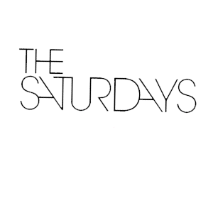
    This is the logo for The Saturdays. As you can see the text is slender and straight, so we will base our logo on this as well. We have decided to call our band name "Autumn" because it is a season rather than a day of the week. This shows the relation between the two groups, but also signifies the difference between the two.
    On the right is a basic font that could be used in our groups logo. Because the band name is a season, rather than a day in the week, there are more aspects that can be related to it. Things like brown leaves, scarves and other things like that. We would be able to use this to add more layers to the simple font to add more texture to it and to make it stand out more. Because of the possibilities of what we can add to the font, we could have something like a core logo then add to it and adapt it for each of the things we do. This would allow us to change the dynamics of the logo according to it's context. An example of this could be having pages around the font to represent that it is a magazine advert. The core logo would likely be to do with Autumn, to emphasize the significance of the song name. We would have to be careful when designing the logo so that we don't leave too much empty spaces so that it looks unprofessional as well as leaving enough space so that the new layers to it will be enough to make an impact and so that customers can see the difference and recognize that it is to do with something else.

    Storyboard Timeline

    This is our storyboard timeline. To make it easier to understand, we used a key, using three numbers to represent what will be happening in each box or 5 second gap. 
    The 1s represent the scenes within the car
    The 2s represent the times when the music video is shot in the park and
    The 3s are when the dance sequence is happening on the stage.


    Ideas for our concert/ dance scene

    Due to our previous test footage, we found out which colours of lights to use, which are blues, purples and reds to create the appropriate feel for our video during this scene, we also found out that the drama studio has a projector allowing us to project either a backdrop or to film half of our group and project them into the background meaning we are only dealing with one half of our group at once instead of all four.

    Concert Backdrops:


    © 2009 13U1-46 Music Video 2011. All Rights Reserved | Powered by Blogger
    Design by psdvibe | Bloggerized By LawnyDesignz